The Problem
PetMatch is focused on adoption of cats and dogs from animal shelters and rescue organizations. The main problem I wanted to solve was to make the process of finding a pet and applying for adoption easier for people who are interested in doing so.
Most of the time users have to check individual websites for each organization when searching for a pet, so PetMatch’s goal is to gather all in one place, so it can be helpful to both users and the organizations involved.
My Role
I was the sole UX designer for this project. I worked on the development of each screen from sketches to the final design version. Choices were made based on research and insights from user interviews.
Solutions
Throughout the whole design process I made choices and performed iterations based on user’s feedbacks and research made on interviews.
My proposed solution was to create the app, PetMatch, where users could navigate through profiles from animals up for adoption, from different organizations, making the process easier and faster, instead of having to check several websites from different organizations.
Users can not only look for a pet but also get in touch with organizations and submit adoption applications on the app.
Personas
Early Sketches
Main Pain Points:
• Facilitating the search of an animal for adoption
• Making the application process easier, by having it all in one place
Most Critical Features:
• Being able to search and learn more about the animal the user wants to adopt
• Having easy access to the organization’s contact information and application form
Low-fidelity Wireframes
Challenges
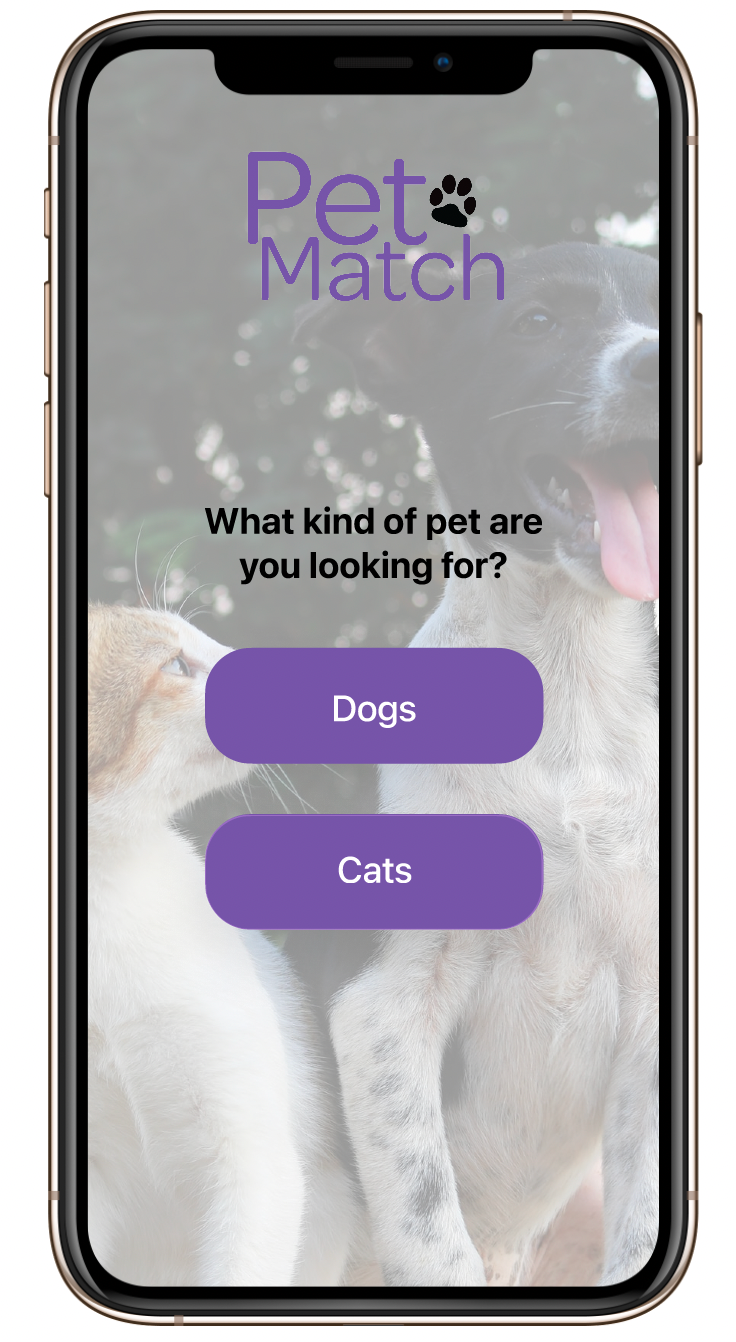
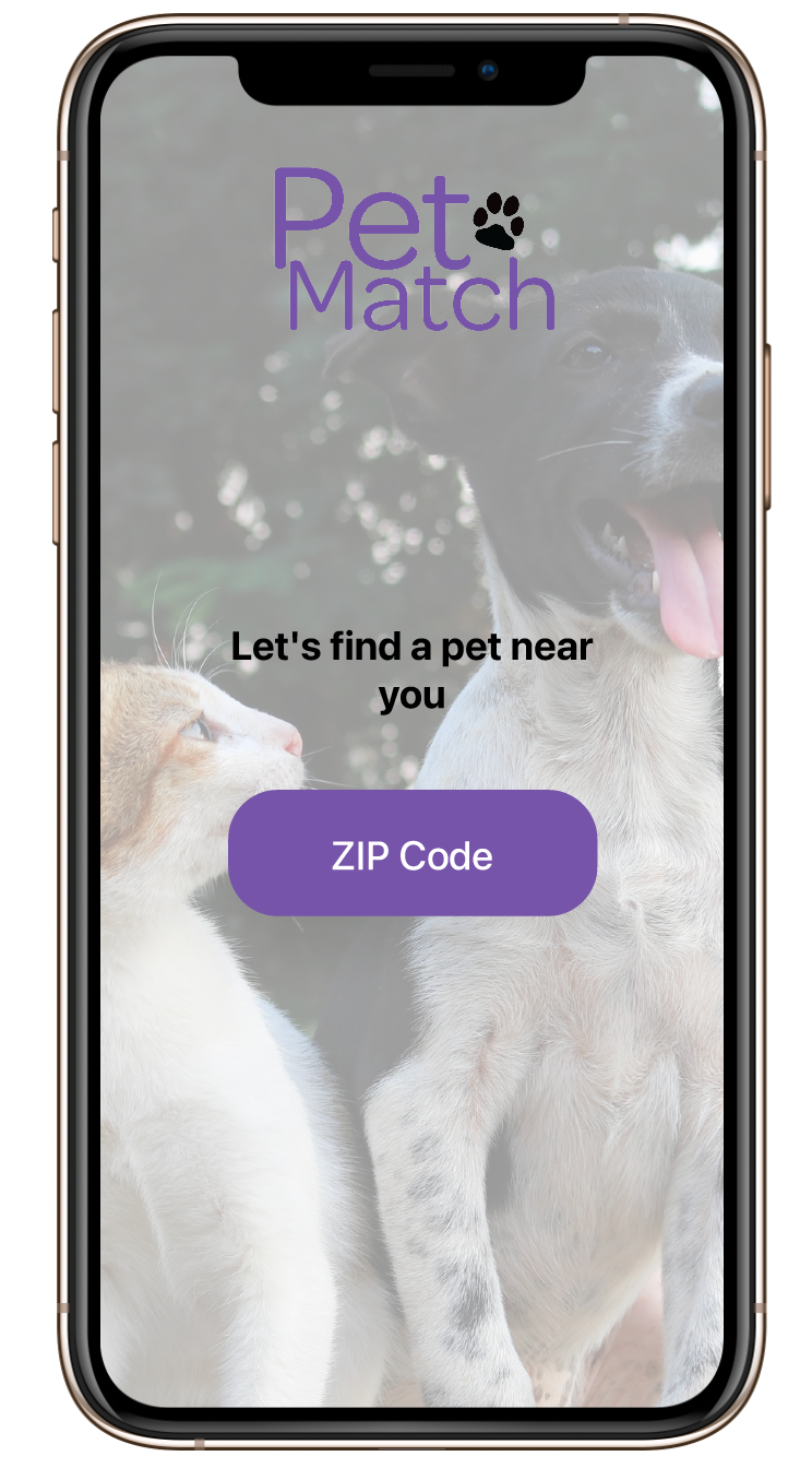
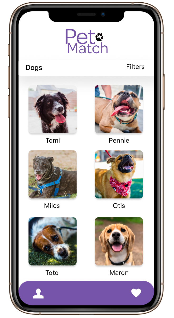
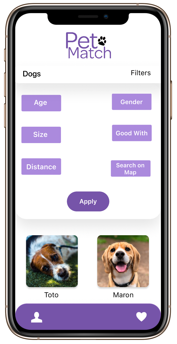
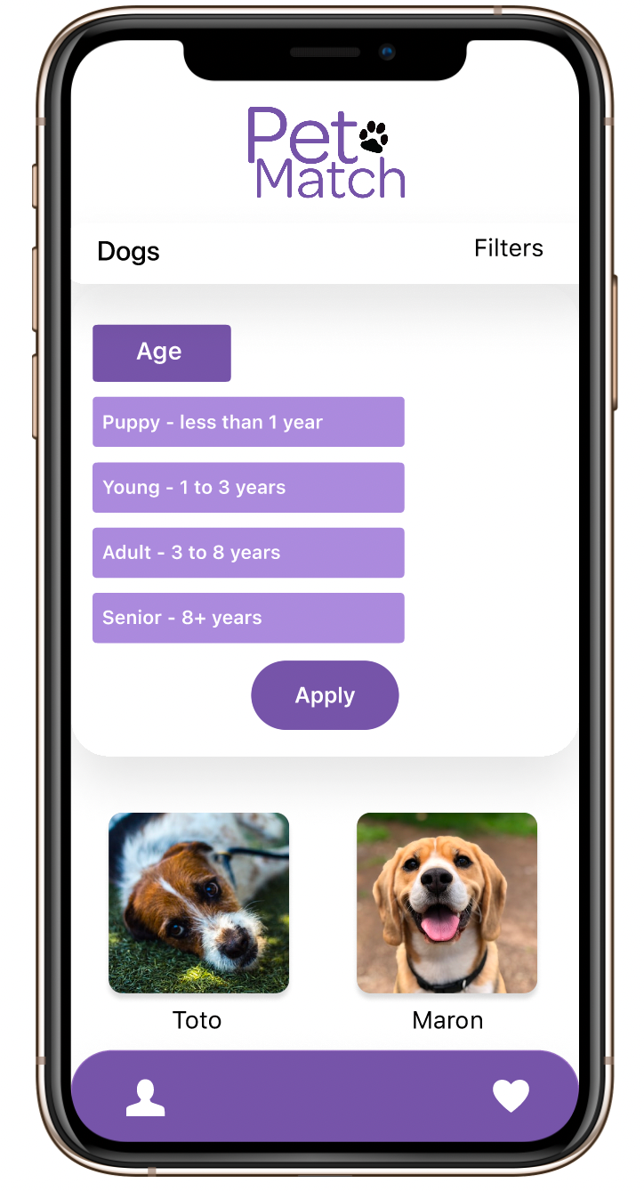
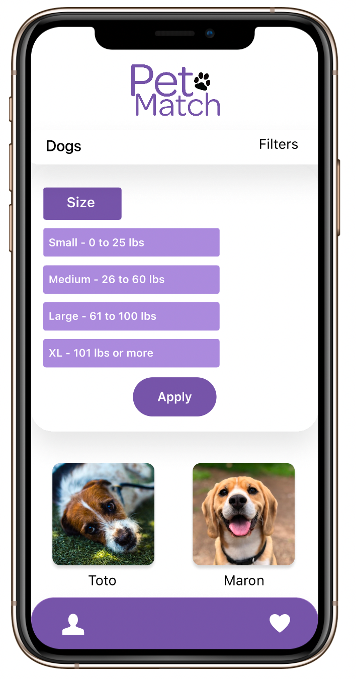
During the design process, my initial challenge was determining the appropriate color palette for the app. I aimed for a friendly and uplifting feel, but found it difficult to incorporate a broad range of colors without compromising the visual cohesion. To overcome this challenge, I conducted user interviews and received valuable feedback regarding color preferences and associations. As a result, I decided to use a neutral base color and a monochromatic palette for details, which better aligned with the users' expectations and preferences.
High-fidelity Wireframes
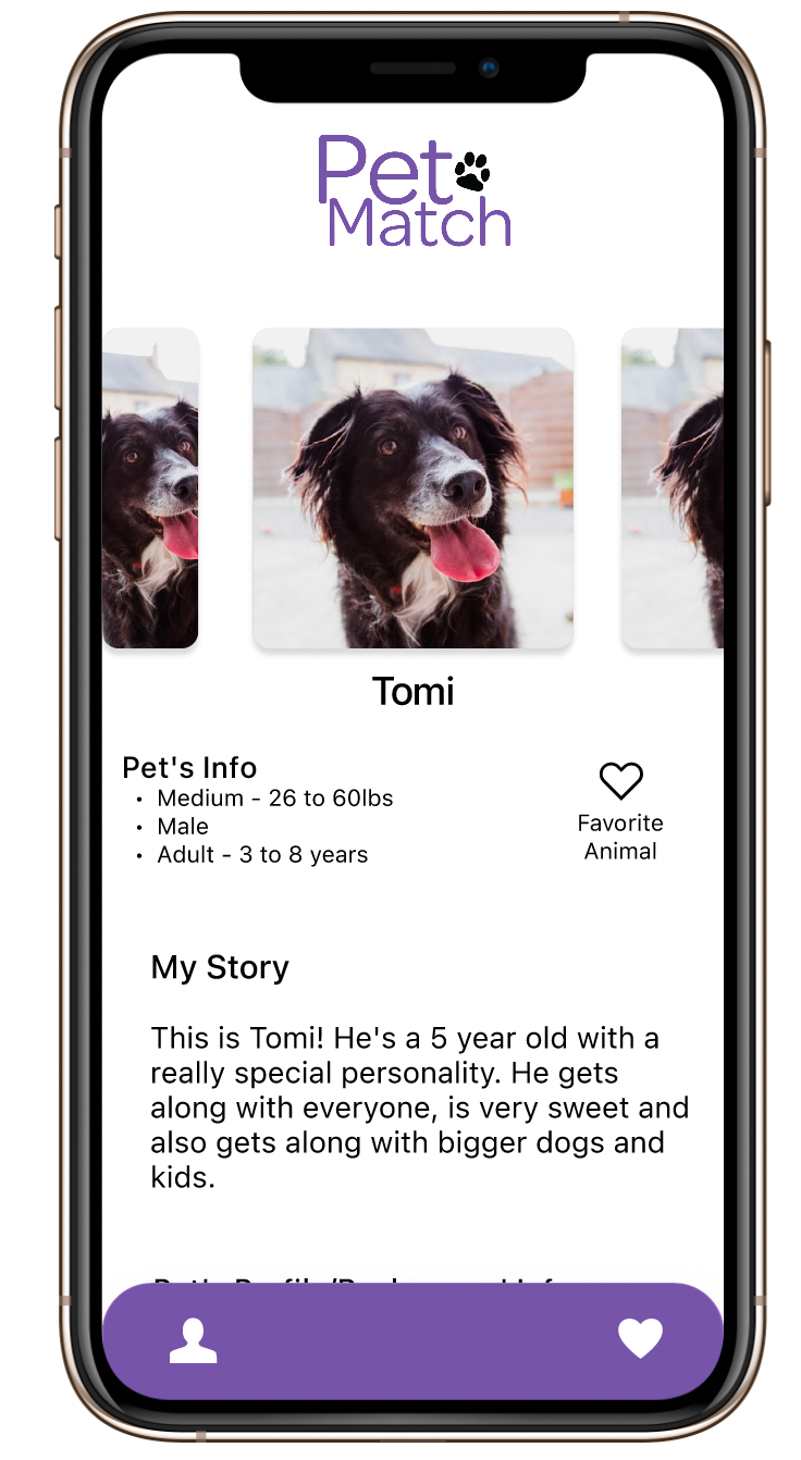
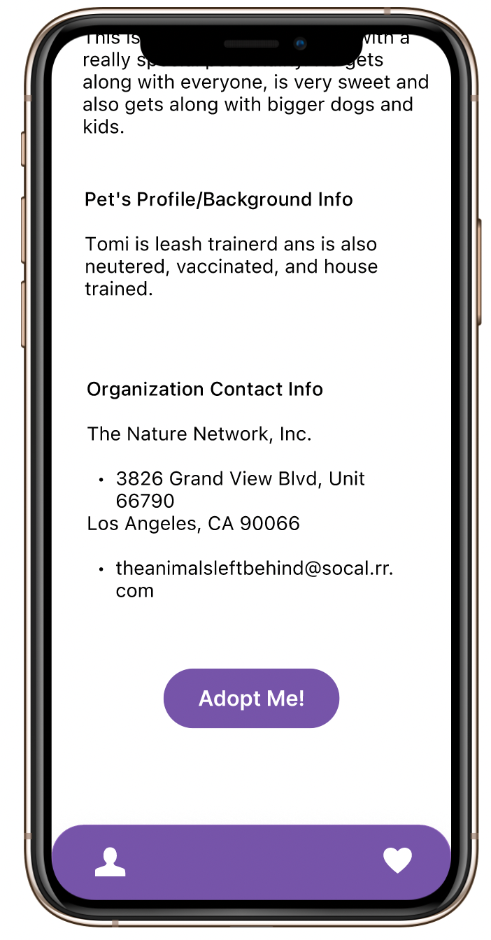
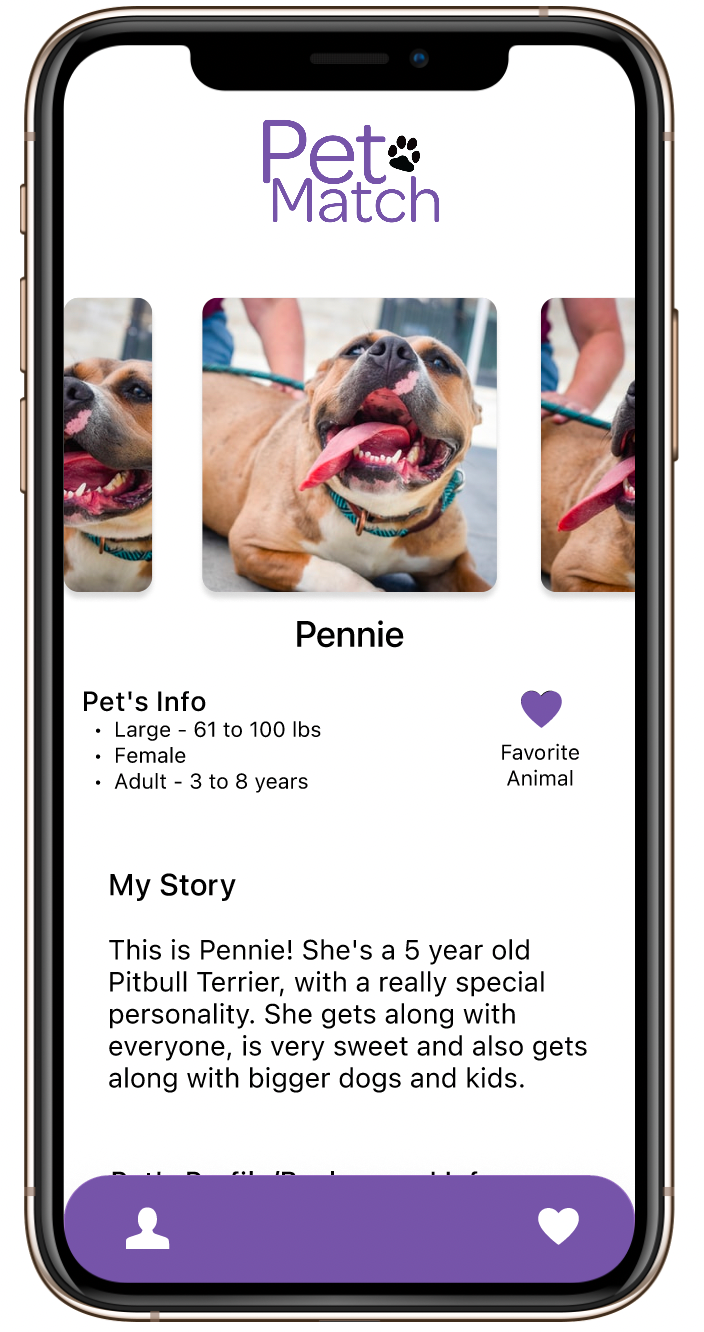
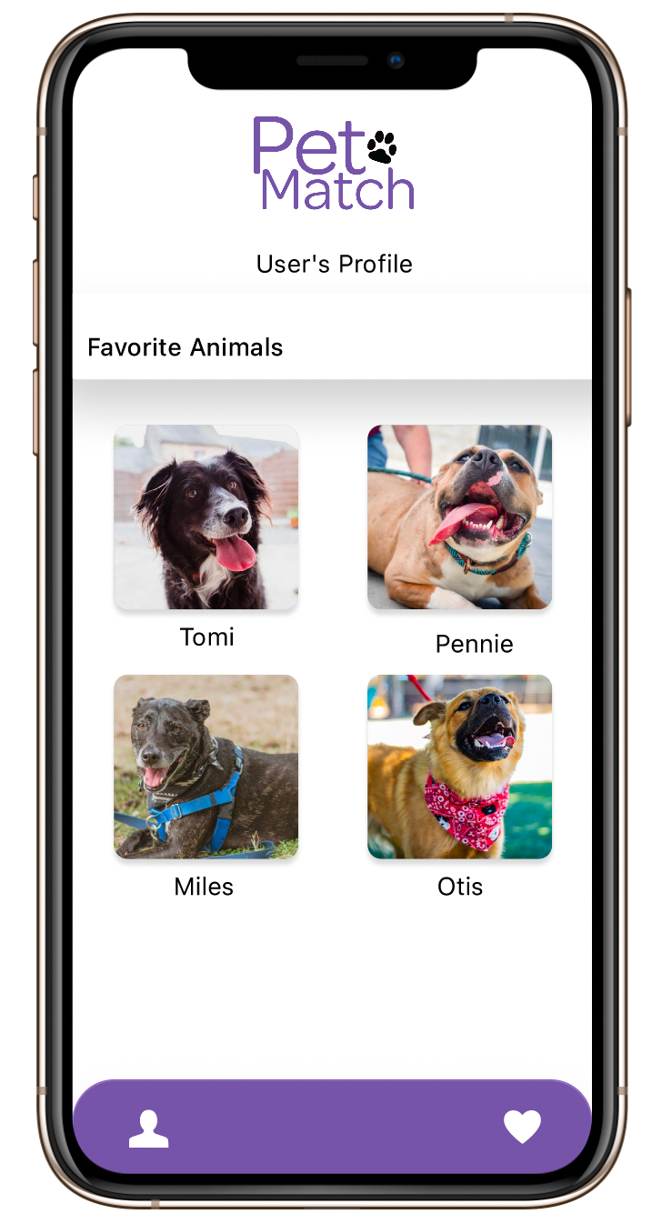
Takeaways
Throughout this project, I learned the critical importance of conducting extensive research and actively listening to user feedback. While I initially had my own vision for the project's direction, I realized that ultimately, the users' needs and preferences must be prioritized. As a result, I implemented various methods of user research, such as interviews and usability testing, to gather insights and feedback. This allowed me to make informed design decisions that aligned with the users' needs and goals. I recognize that the success of any project relies on a user-centered approach, where user feedback and insights play a pivotal role in shaping the final product.
Prototype

